ESO visual identity
ESO
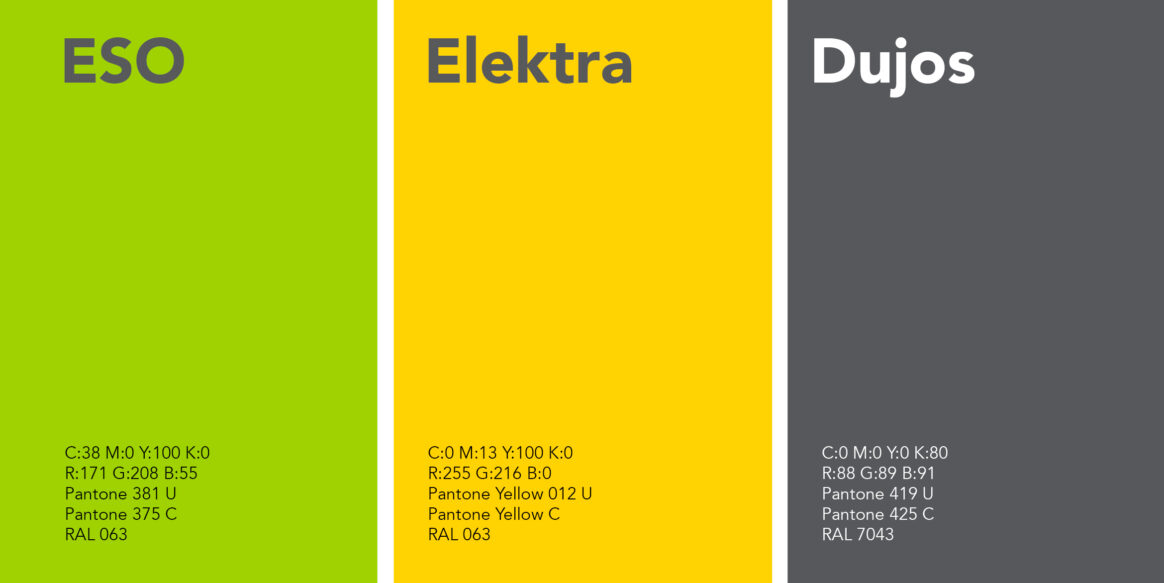
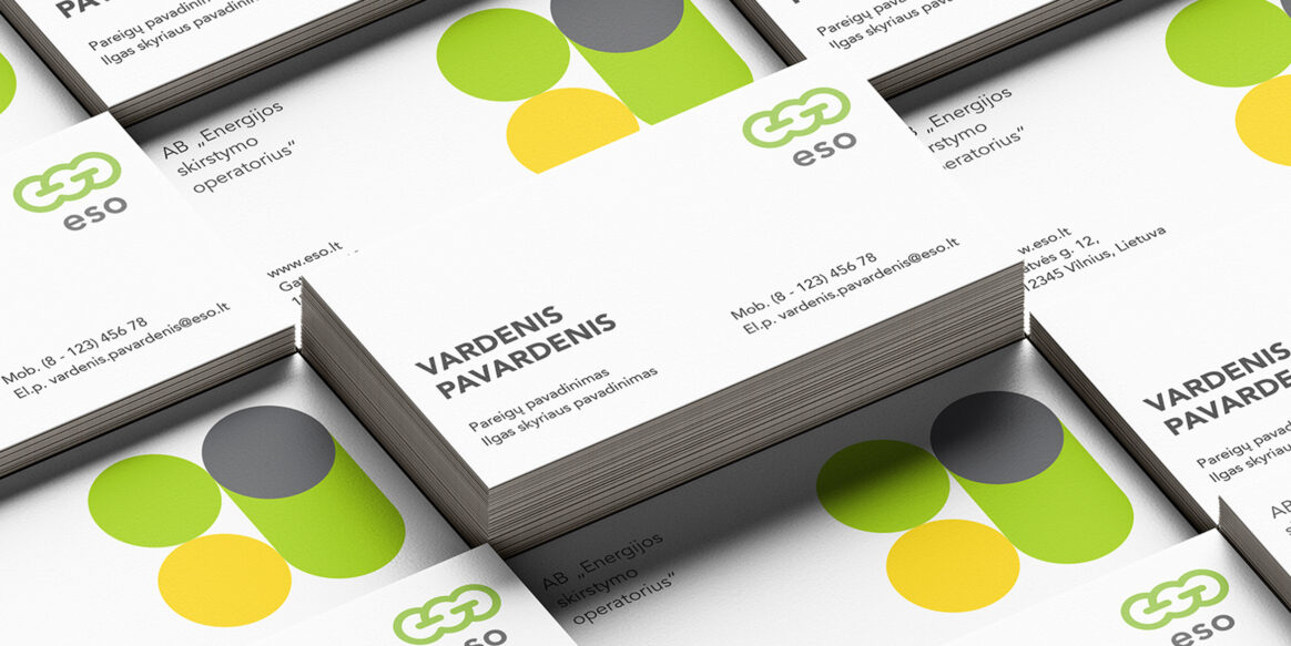
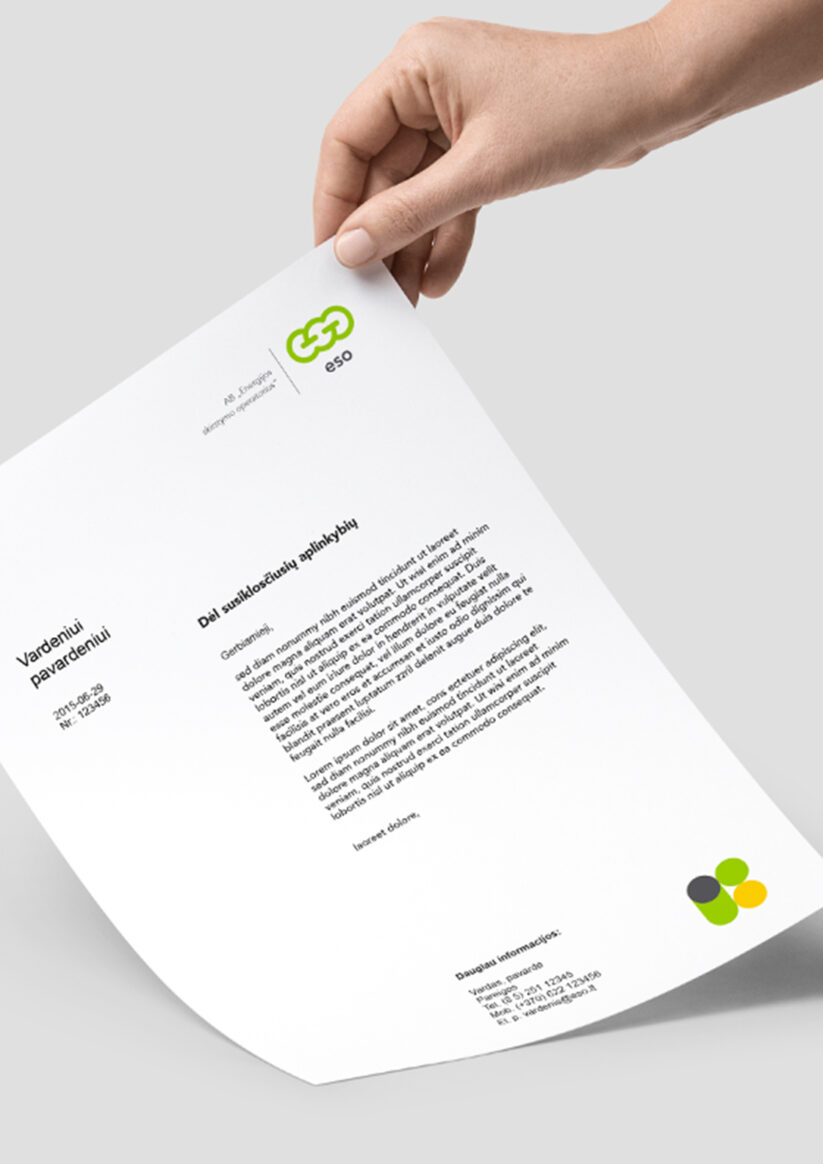
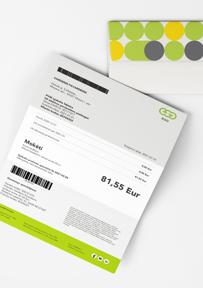
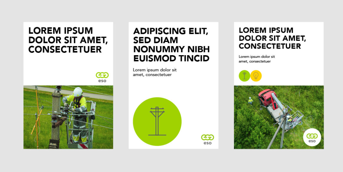
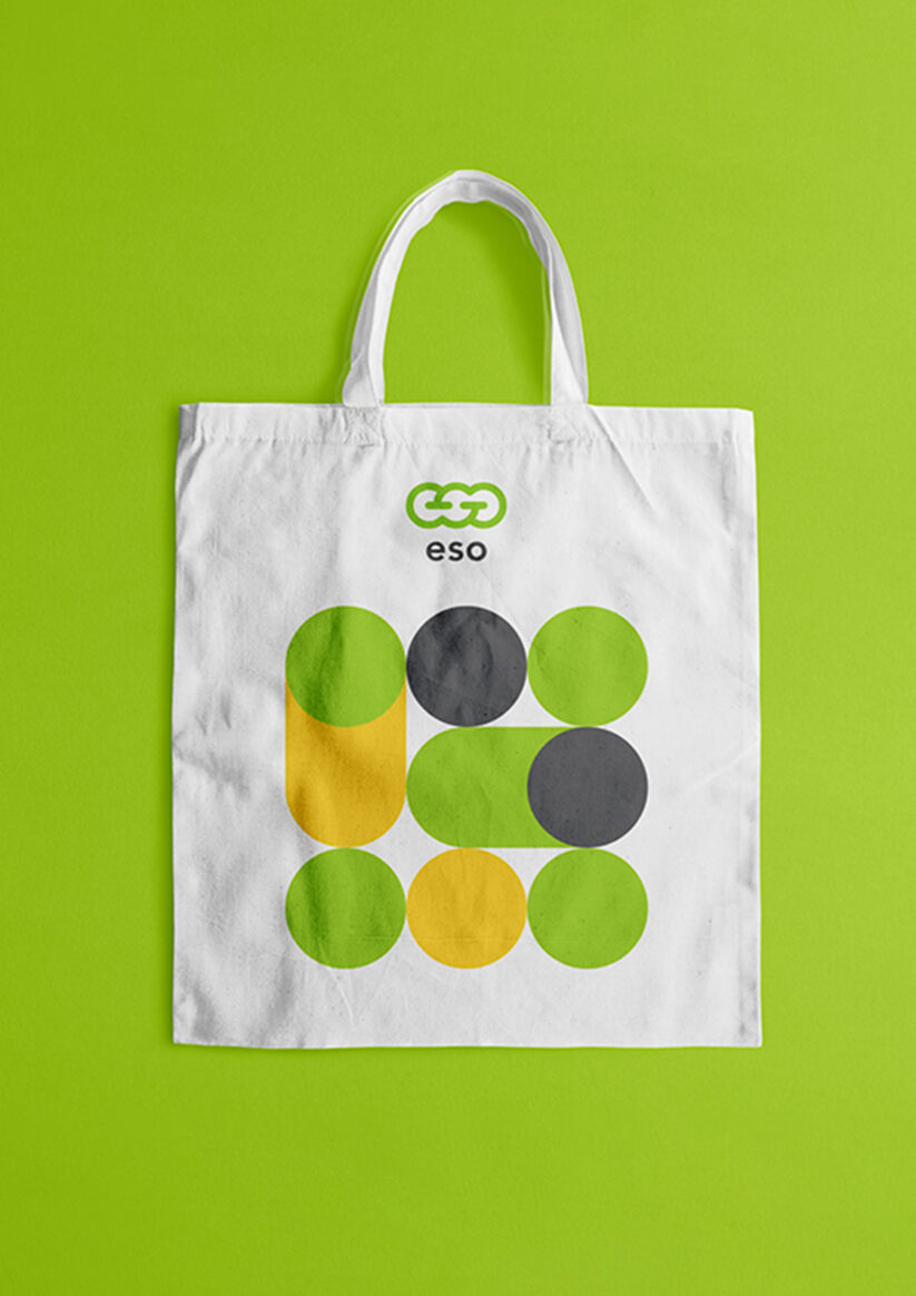
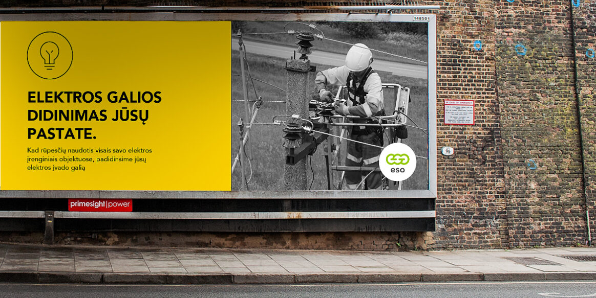
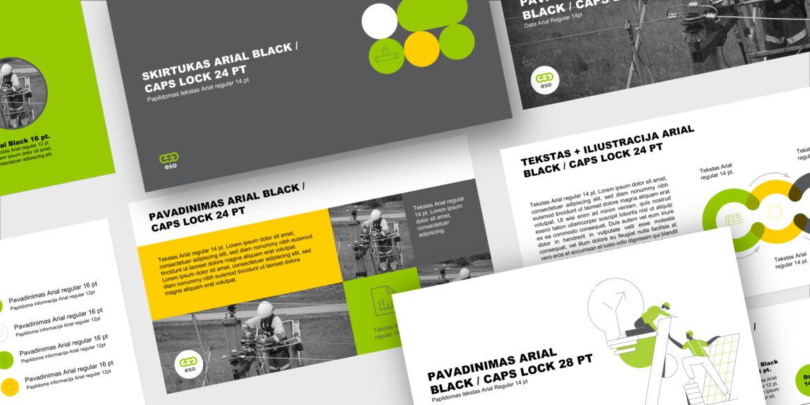
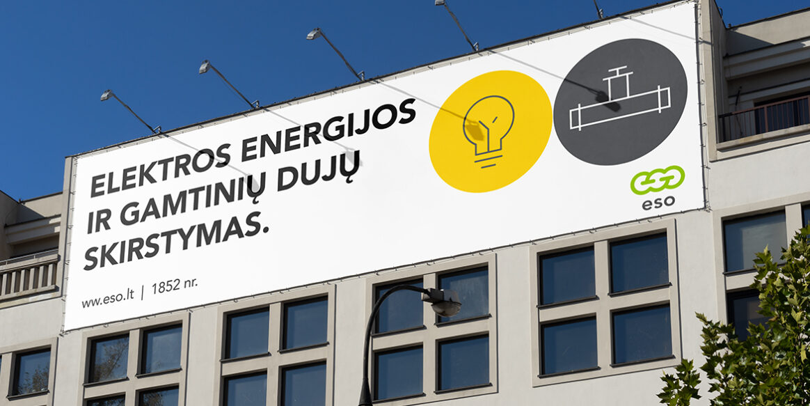
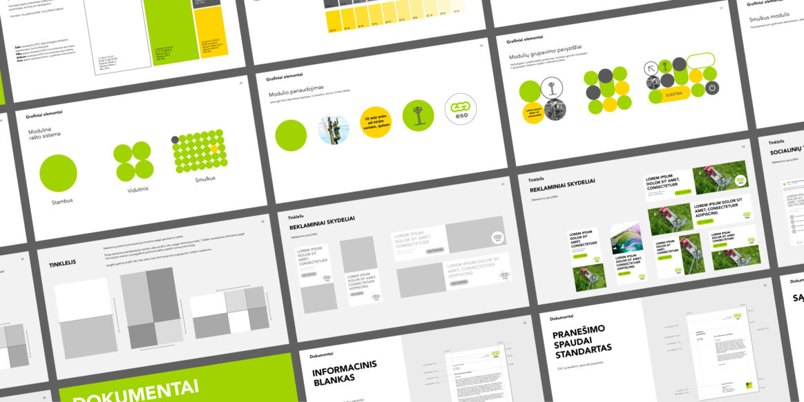
ESO is an energy distribution operator and a part of IGNITIS group that is positioning #EnergySmart. ESO decided to update its visual identity that would be in line to IGNITIS group positioning, modern and relevant to design trends. We got inspired by circle shape and used it as a key element in the logotype. The updated logotype is formed from ESO letter monogram and symbolizes the energy chain of gas and electricity networks. Circles here acquire the switch symbol that reflects the smart energy concept. The primary green colour represents energy and renewal, while grey adds solidity to the brand identity. New visual communication represents the company as a smart, reliable, advanced energy distribution operator and complements the IGNITIS group brand image.