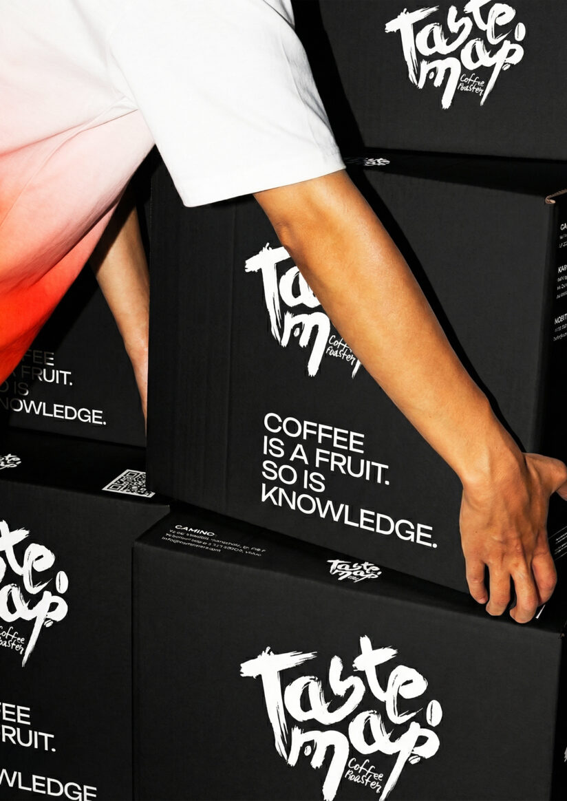
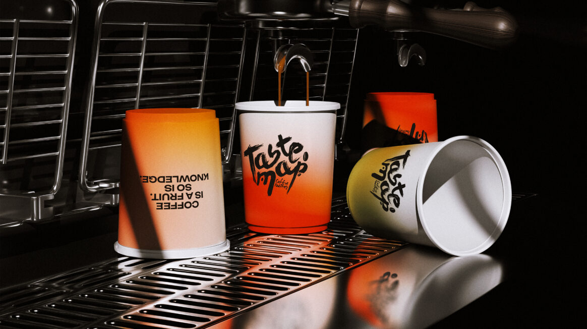
TASTE MAP visual identity
Taste Map Coffee Roasters
TASTE MAP is more than just specialty coffee roasted and brewed every day. Within this family-run roastery and its cafés, a coffee culture is carefully nurtured – one that invites people to explore the world of coffee, especially through taste. To give TASTE MAP a stronger visual presence and clearly communicate these values, our task was to create a new visual identity, redesign the website, and update the packaging.
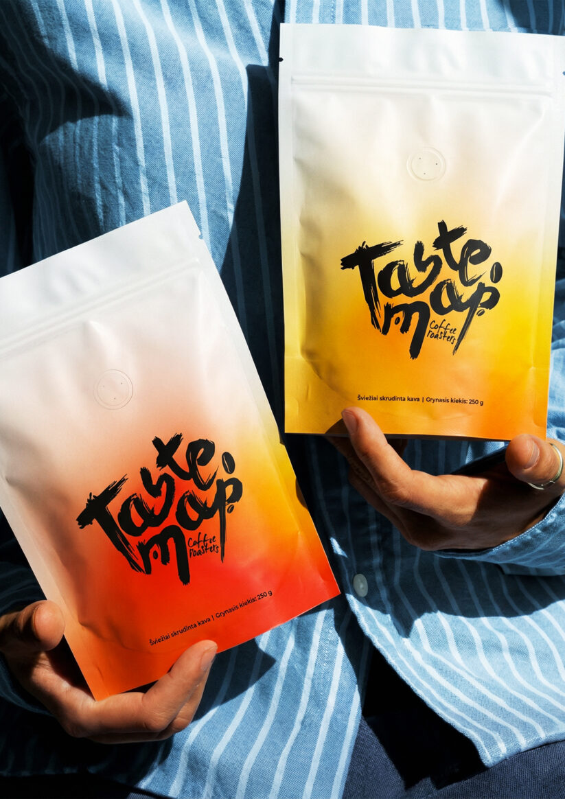
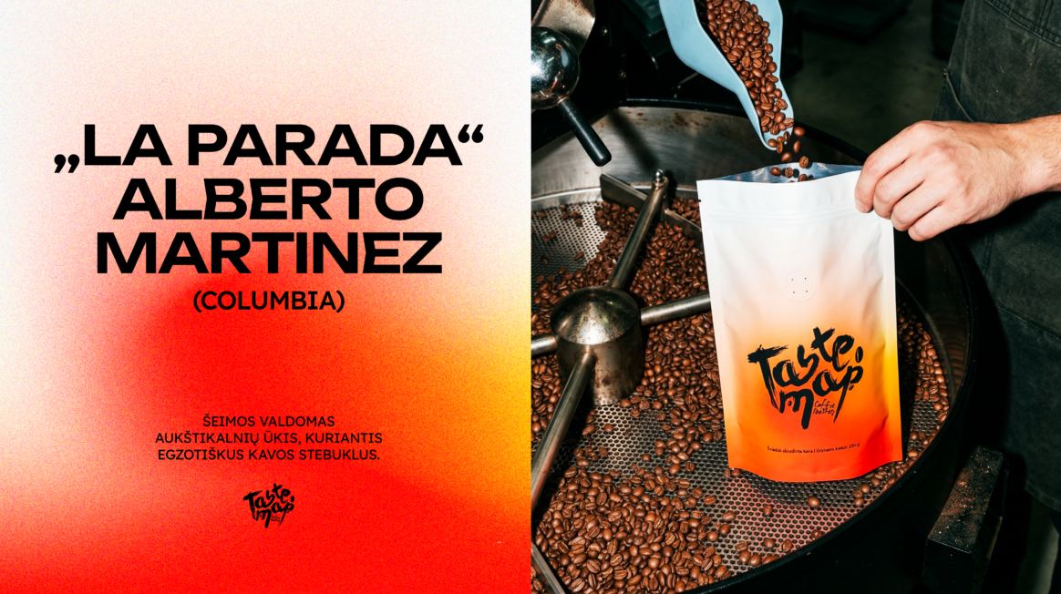
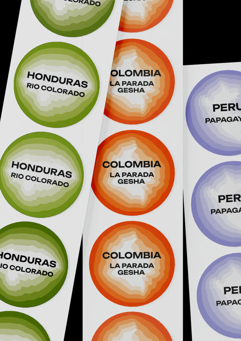
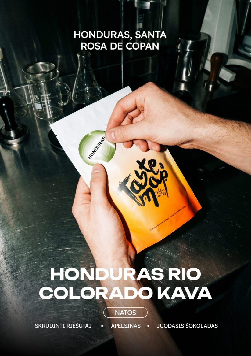
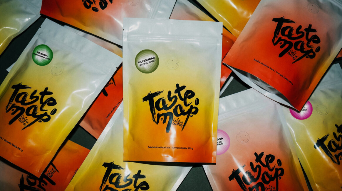
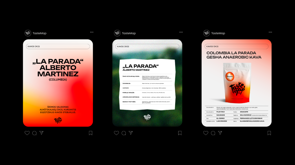
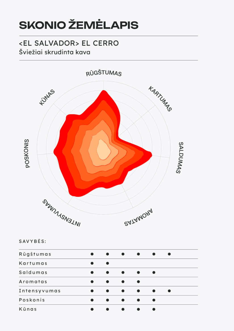
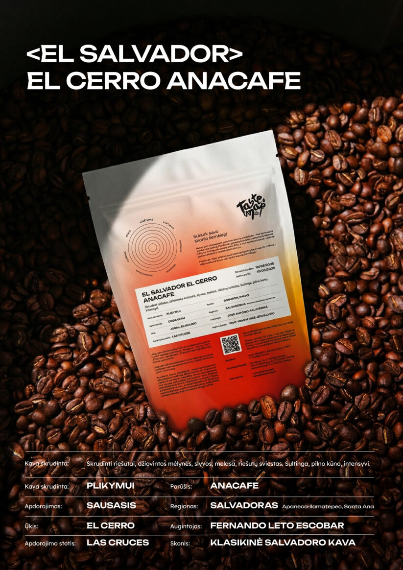
The new visual language was inspired by coffee flavor profiles, which we combined with topographic illustrations of mountain landscapes and expressed through varied color palettes. For each coffee, a distinct terrain, color, and form was created based on its country of origin and flavor characteristics, making every flavor profile unique.
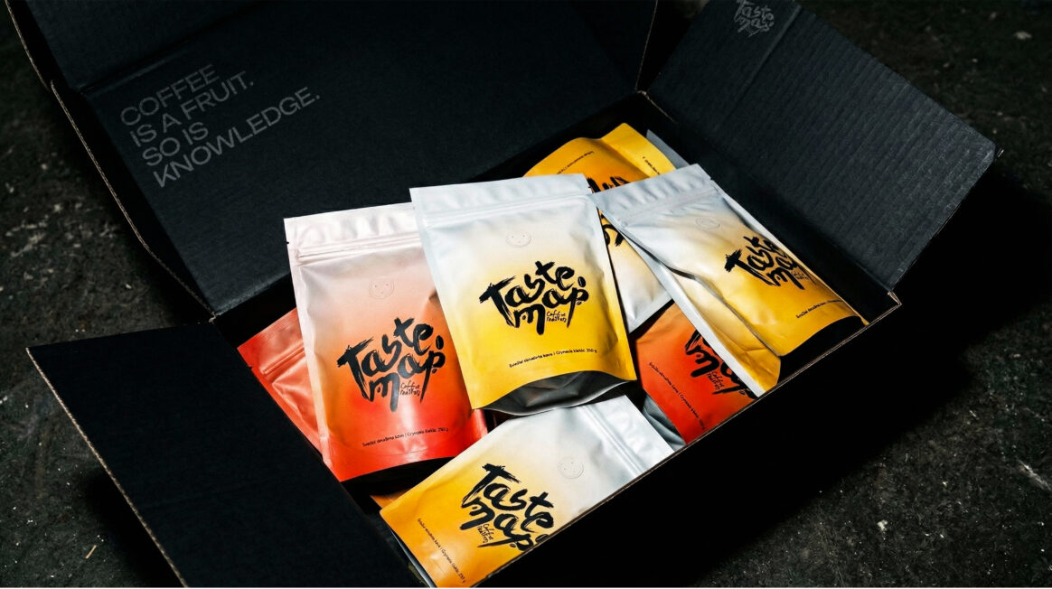
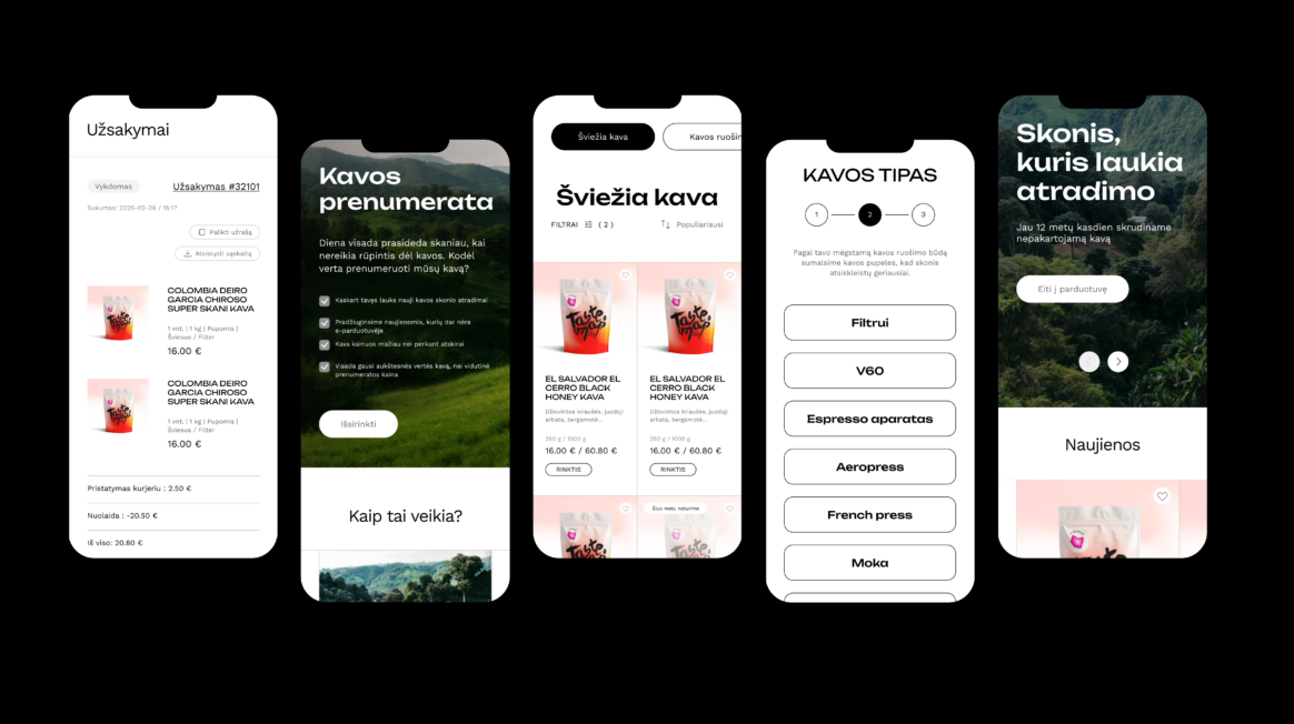
The new website interactively reveals the diversity of coffee flavors and allows users to explore the coffee world with ease. After discovering and purchasing the coffee that suits them best, users are encouraged to slow down, taste it mindfully, and mark the perceived flavor notes directly on the packaging. In this way, TASTE MAP strengthens its role as an educator of coffee flavor, helping inspire people better understand and enjoy it.