Scroll
Contact
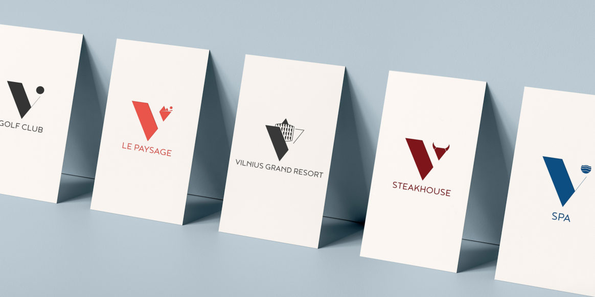
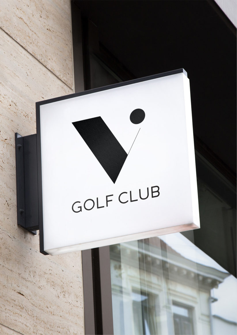
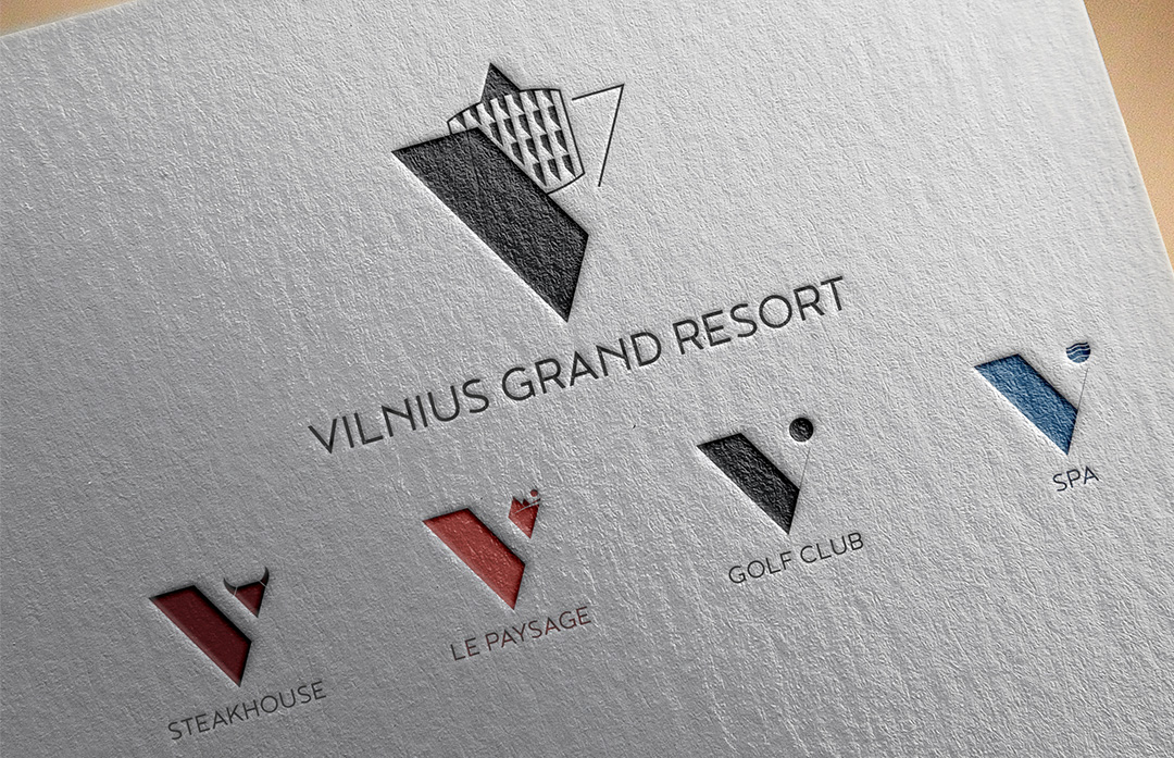
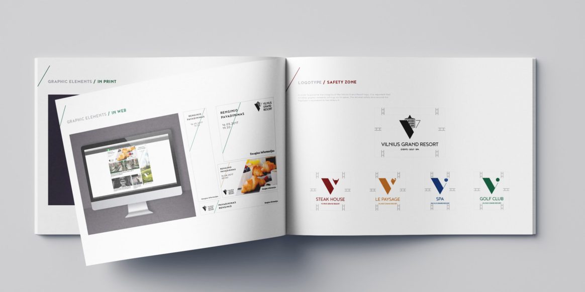
V stands for Vilnius
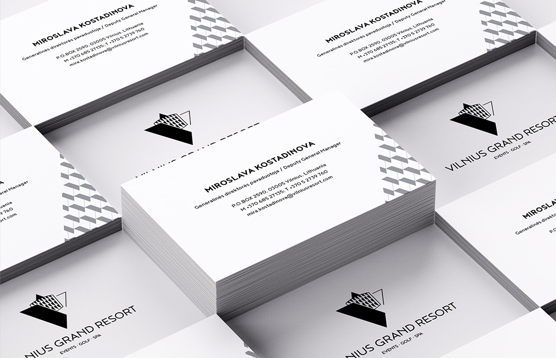
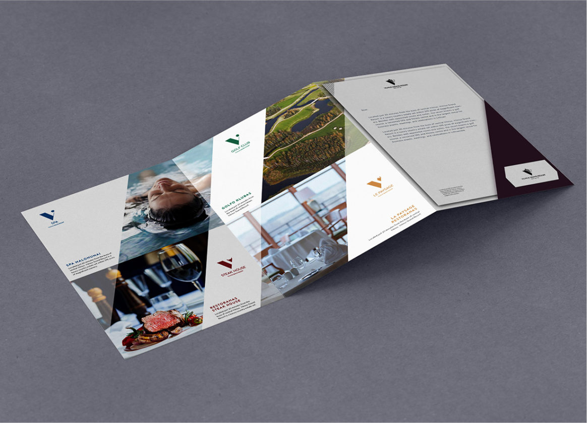
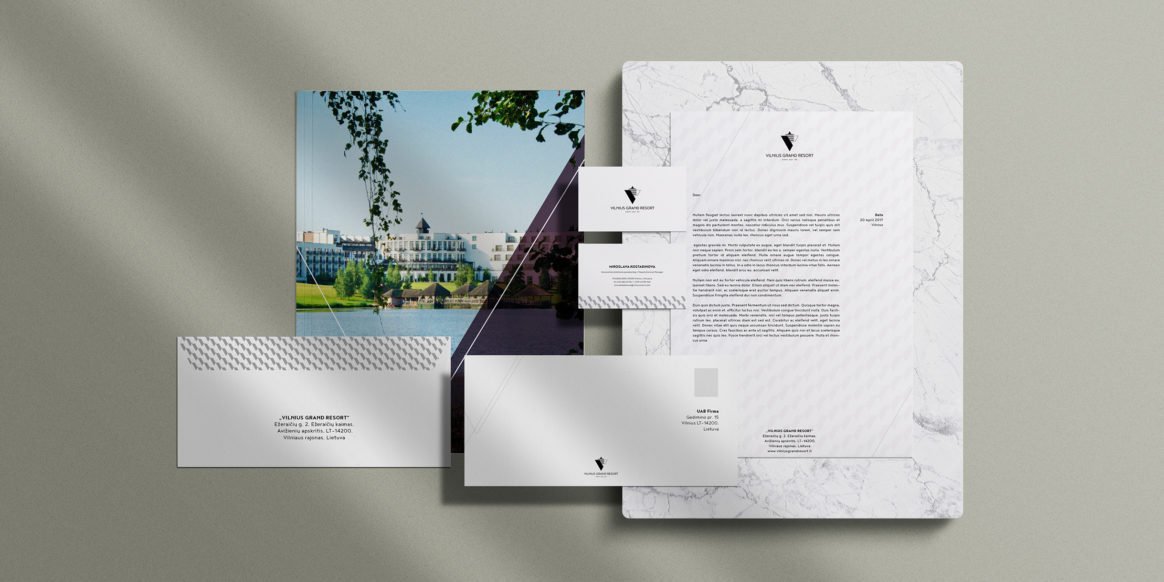
Vilnius Grand Resort
Vilnius Grand Resort is a luxury country estate with a magnificent scenery and is perfectly suited for an unforgettable family vacation. However, after changing its name from „Villon“ to „Vilnius Grand Resort“ it lost its identity and needed rebranding. In the main logo we’ve chosen to portray the magnificent Vilnius Grand Resort building and a letter V, which stands for Vilnius as the uniting element in all other logos. Vilnius Grand Resort now has a new face and we hope that its ghosts of previous names would no longer haunt it.